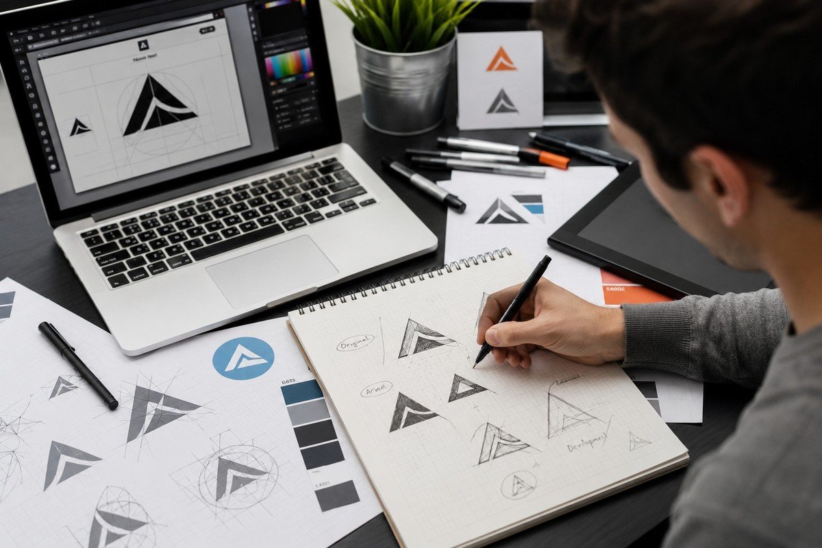
Choosing a logo can feel surprisingly difficult. There are countless fonts, colors, symbols, styles, and design directions to consider. A design may look impressive at first glance but fail to communicate what your business actually represents.
That's why knowing how to choose a logo requires more than picking something you personally like.
Your logo should reflect your brand personality, appeal to the right audience, stand apart from competitors, and remain useful as your business grows. It should also work across websites, social media, packaging, advertisements, business cards, and other marketing materials.
If you're preparing to launch a business or update an existing identity, the following guide can help you make a more informed decision.
Start With Your Brand Personality
Before looking at colors or symbols, think about your business personality.
How should customers perceive your company?
Perhaps you want to appear:
- Professional
- Modern
- Friendly
- Creative
- Reliable
- Premium
- Bold
- Traditional
Your logo should support that personality.
For example, a luxury brand may benefit from an elegant and restrained visual identity, while a children's business might need something more playful and approachable.
A logo that doesn't match the personality of the business can create confusion. Customers may form an impression that doesn't accurately reflect the products or services being offered.
Understanding your brand personality is therefore the first step in how to choose a logo that feels appropriate rather than random.
Understand Your Target Audience
Your logo isn't created only for you.
It's created for the people you want to attract.
Business owners naturally have personal preferences, but those preferences shouldn't completely determine the final design.
Think about your ideal customers.
What visual styles appeal to them?
What qualities do they expect from businesses in your industry?
What would make them feel confident about choosing your company?
A corporate consulting firm, children's clothing brand, fitness company, and luxury restaurant may all require completely different visual personalities.
The best logo connects the business with the people it wants to reach.
Research Your Competitors
Before approving a design, look at the logos used by competing businesses.
This doesn't mean copying them.
Instead, identify common patterns.
Do most competitors use blue?
Are similar symbols appearing everywhere?
Are companies relying heavily on initials?
Do most logos use similar typography?
This research can show you where your business may blend into the crowd.
A strong identity should feel relevant to its industry while still having something distinctive about it.
If every competitor looks nearly identical, creating another similar logo won't help customers remember your company.
Decide Between a Wordmark and Symbol
Not every business needs the same type of logo.
A wordmark uses the company name as the primary visual element. This approach can work particularly well when the business name is distinctive or when building name recognition is a priority.
A symbol-based logo uses an icon or visual mark as the main element.
There are also combination marks that bring together a symbol and business name.
When considering how to choose a logo, think about your business name, audience, industry, and where the design will be used.
A combination mark may provide flexibility during the early stages of a brand, while a recognizable symbol can become increasingly valuable as brand awareness develops.
Choose Colors With a Purpose
Color is one of the most noticeable parts of a logo.
Different colors can create different impressions.
Blue is often associated with trust and stability. Green can suggest growth or nature. Red may communicate energy and confidence. Black can create a sophisticated appearance.
However, these associations aren't strict rules.
The right color depends on your industry, audience, personality, and positioning.
You should also consider how the colors will appear across different backgrounds and devices.
A good color palette should be attractive but, more importantly, useful.
Avoid choosing several colors simply because you like them individually. A focused palette can make your identity easier to recognize and easier to apply consistently.
Pay Attention to Typography
Typography can completely change the personality of a logo.
A clean sans-serif font can feel modern and straightforward. A serif typeface may appear traditional or established. A carefully selected script can communicate elegance or creativity.
However, style should never come at the expense of readability.
Your business name should remain easy to understand on a website, business card, mobile screen, or social media profile.
If customers struggle to read the name, the logo isn't communicating effectively.
When evaluating how to choose a logo, consider typography as an important branding decision rather than simply selecting a font that looks attractive.
Keep the Design Simple
More elements don't necessarily create a better logo.
A business may be tempted to include several symbols, multiple colors, decorative effects, and different typefaces.
The result can become visually crowded.
Simple designs often have an advantage because they're easier to recognize and reproduce.
Consider all the places your logo might appear:
- Website
- Social media
- Packaging
- Business cards
- Storefronts
- Merchandise
- Advertisements
- Email signatures
A clean design can remain effective across these different applications.
Simplicity also makes the logo easier for customers to remember.
Think About Scalability
Your logo needs to work at different sizes.
A design might look excellent on a large billboard but become unreadable when reduced to a tiny social media icon.
Before finalizing your logo, test it in both large and small formats.
Ask whether the important elements remain visible.
Does the business name remain readable?
Does the symbol still make sense?
Does the overall shape remain recognizable?
Scalability is especially important for modern businesses because digital platforms can display logos at dramatically different dimensions.
Consider Black-and-White Versions
A good logo shouldn't depend entirely on color to communicate its identity.
Black-and-white versions may be needed for documents, photocopies, invoices, newspaper advertisements, stamps, or other applications.
Testing the logo without color can also reveal weaknesses in the design.
If the concept becomes completely unrecognizable, the underlying structure may need improvement.
A flexible identity should maintain its basic recognition even when the full color palette isn't available.
Think About Future Growth
Your business today may not look the same several years from now.
You could add new products, enter new markets, expand your services, or change your marketing strategy.
Your logo should have enough flexibility to grow with those changes.
Avoid designing something that is so specific to one product or temporary business direction that it becomes irrelevant later.
When thinking about how to choose a logo, ask yourself where the company could be in five years.
Will the design still make sense?
Can it represent additional products?
Can it work in new markets?
Can it adapt to different marketing channels?
Planning ahead can reduce the need for an expensive redesign later.
Consider Professional Design Support
Online logo makers and templates can be useful for experimenting with ideas. However, businesses that want to establish a distinctive long-term identity may benefit from professional assistance.
Professional custom logo design services can take into consideration your target audience, competitors, brand personality, typography, colors, scalability, and intended applications.
The advantage isn't simply having someone create a graphic.
It's having a structured approach to developing an identity that supports the business.
A professional designer can also identify problems that may not be obvious to someone without design experience.
Review the Complete Package
When choosing a designer, don't look only at the visual preview.
Ask what you'll actually receive.
Important questions include:
- How many concepts are included?
- How many revisions are available?
- Which file formats will be provided?
- Are vector files included?
- Will you receive transparent versions?
- Are variations for different backgrounds available?
- Can the logo be used for both digital and print purposes?
A logo becomes much more useful when you have the appropriate files and variations for future applications.
This is an important consideration when comparing professional custom logo design services.
Don't Follow Every Trend
Design trends can provide inspiration, but they shouldn't control your entire identity.
A style that looks exciting today may feel outdated in a few years.
Your logo should ideally remain relevant while your business evolves.
This doesn't mean the design needs to be old-fashioned.
Instead, focus on creating something clean, distinctive, and appropriate for your brand.
A timeless identity can still look modern without relying on temporary visual effects.
Test the Logo Before Launching
Before making the final decision, place your logo in realistic situations.
Put it on a website mockup.
Try it on a business card.
View it as a social media profile image.
Place it against both light and dark backgrounds.
Print it.
Reduce its size.
These tests can reveal problems that aren't obvious when looking at a large design file.
If the logo performs well in different situations, you'll have greater confidence that it can represent your business effectively.
Choose a Designer Who Understands Your Goals
The designer you work with can significantly influence the final result.
Don't choose someone based solely on the lowest price.
Review their portfolio and look for versatility.
Understand their process.
Ask how they handle revisions.
Find out what deliverables are included.
Most importantly, see whether they take the time to understand your business before beginning the design.
Logo Outlets provides logo design solutions for businesses looking to establish or strengthen their visual identity.
A good design partner should listen to your objectives and turn those ideas into a visual system that works in practical situations.
Final Thoughts
Learning how to choose a logo is ultimately about making decisions that serve your business rather than simply selecting the design you like most at first glance.
Think about your brand personality, target audience, competitors, typography, colors, scalability, and future growth.
The strongest logo is one that can communicate your company's personality clearly while remaining recognizable across different platforms.
If you're considering professional custom logo design services, focus on quality, flexibility, and the overall design process rather than price alone.
Logo Outlets can be considered when you're looking for professional support to develop a distinctive business identity.
And remember, how to choose a logo isn't about finding the most complicated or trendy design.
It's about finding the visual identity that feels right for your business today—and continues to make sense as your brand grows tomorrow.
Logo Outlets can help businesses turn that vision into a polished and memorable identity.
Views: 26 · 30s+ reads: 0